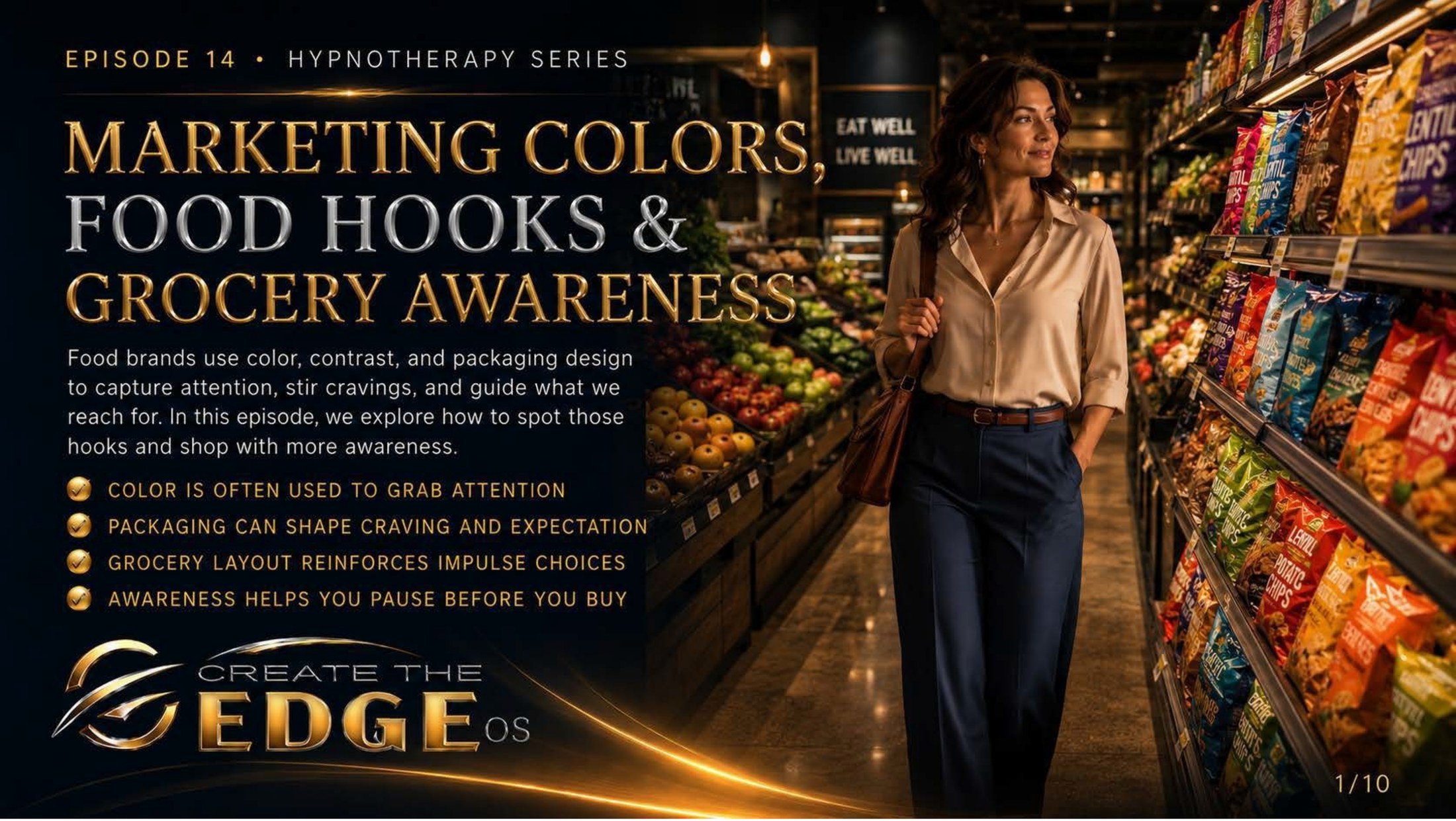
On the slideFood brands use color, contrast, and packaging design to capture attention, stir emotional responses, and guide what we reach for. How to spot those hooks and move through the world with more awareness: color is often used to grab attention · packaging can shape craving and expectation · grocery layout reinforces impulse choices · awareness helps you pause before you buy.
Episode 14 · Slide 1
Marketing Colors, Food Hooks & Grocery Awareness
Look at her walking through that store with her shoulders back and her eyes clear, not panicked, not rigid, not white-knuckling her way past every display. She’s just — aware. That’s the entire difference this chapter is about. Not resistance. Not rules. Not the kind of grim, clenched willpower that collapses the moment you’re tired or sad or rushed. Just awareness. The simple, quiet, enormously powerful act of seeing what’s actually happening around you and making a conscious choice in response to it.
Because here’s something nobody tells you when you walk into a grocery store: you are not in a neutral environment. Every color, every display, every label, every piece of music playing overhead was chosen by someone who has studied your nervous system more carefully than you have. Not maliciously, necessarily — just professionally. This is what food marketing does. It uses everything we’ve been learning about color and emotion and subconscious response and turns it into a commercial strategy.
And it works. Of course it works. It’s designed by people who understand exactly how human beings respond to visual stimulation, to urgency cues, to the promise of pleasure and comfort. The fact that you’ve ever reached for something you didn’t intend to buy, or walked out with more than was on your list, or felt an almost magnetic pull toward a certain display — that’s not weakness. That’s your perfectly normal human nervous system responding to a perfectly engineered stimulus. You were working exactly as designed. Just not by yourself.
This chapter is the antidote. Not a list of forbidden items, not a strict protocol for the perfect shopping trip, but something more lasting: understanding. When you understand how the visual environment of a store is engineered to shape your emotional state and guide your choices, something in you shifts. The hook is still there. The colors are still there. But you can see them now. And a hook you can see has already lost most of its power.
The four threads running through this chapter: color is used to grab your attention before you’ve made any conscious decision, packaging shapes craving and expectation before you’ve tasted a thing, the physical layout of a grocery store reinforces impulse choices through deliberate design, and awareness — simple, practiced, non-judgmental awareness — gives you the space to pause and choose. That pause is everything.
So take my hand and let’s walk through that store together — eyes open, shoulders back, genuinely curious about the architecture of the world that’s been quietly shaping your choices. We’re not here to be afraid of it. We’re here to understand it. And understanding it, as always, is the beginning of freedom.
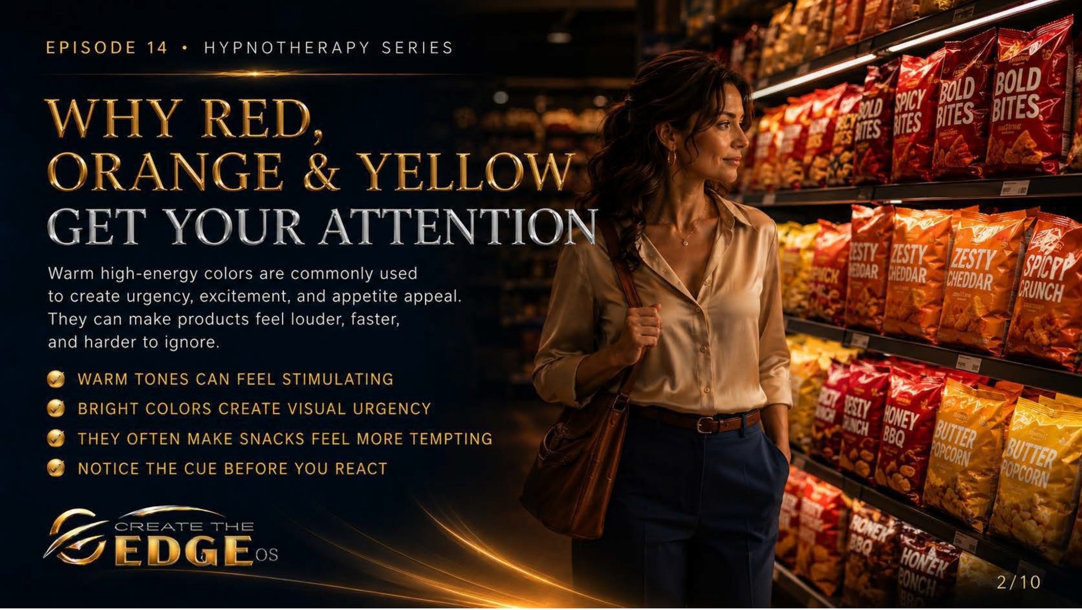
On the slideWarm high-energy colors are commonly used to create urgency, excitement, and emotional arousal. They can make products feel louder, faster, and harder to ignore: warm tones can feel stimulating · bright colors create visual urgency · they often make products feel more emotionally compelling · notice the cue before you react.
Episode 14 · Slide 2
Why Red, Orange and Yellow Get Your Attention
Look at the shelves behind her — a wall of reds and oranges and yellows screaming from every angle, product names in bold, images designed to feel energetic and loud and exciting. And notice what that visual environment does to your nervous system just looking at this image. Something activates. Something speeds up slightly. That’s not an accident. That’s the whole point.
Red, orange, and yellow are the workhorses of food marketing because they reliably produce activation in the nervous system. Red heightens attention and creates urgency. Orange carries social energy and excitement. Yellow activates and uplifts. Together, in the saturated, high-contrast versions you see on food packaging, they combine into something that registers in the body as: important. exciting. get it now.
And the food industry has known this for decades. Walk down any snack aisle in any supermarket and you will see it immediately once you know what you’re looking at — a deliberate, researched, carefully tested use of warm color to create a state of emotional arousal that makes reaching for a product feel natural, even necessary. The urgency you feel standing in front of a display isn’t coming from you. It’s being generated by the environment around you.
This is the slide’s most important instruction: notice the cue before you react. Not fight it. Not shame yourself for feeling it. Just notice. Oh — there’s that activation. I can feel the urgency being generated by this display. Interesting. That moment of observation — naming what’s happening in your nervous system — is where automatic behavior and conscious choice diverge. Before you notice, you respond. After you notice, you can choose.
I’ve walked through stores with this awareness and it’s genuinely a different experience. Not joyless — actually more interesting, because you start to see the design everywhere. The red sale tags. The orange “new product” banners. The yellow “special offer” flashes. Once you know what the colors are doing, they stop doing it quite so automatically. The hook is visible. And a visible hook is a hook you can choose to take or leave.
We don’t fail, we fall forward. Every time you’ve reached for something in a red-and-orange display without knowing why, you were responding authentically to a designed stimulus. That’s not a character flaw. That’s a human nervous system doing exactly what it’s built to do. Now you know what it’s responding to. And now, you get to decide.
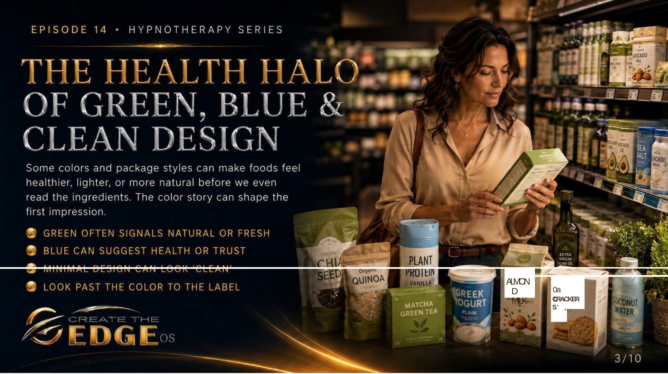
On the slideSome colors and package styles can make foods feel healthier or more natural before we even read the label. The color story shapes the first impression: green often signals natural or fresh · blue can suggest health or trust · minimal design can look clean · look past the color to the actual label.
Episode 14 · Slide 3
The Health Halo of Green, Blue and Clean Design
And here’s where it gets subtler and, in some ways, more interesting. Look at the products she’s examining — all those greens and blues and clean minimal packages, names like “naturally delicious” and “organic,” the whole aesthetic whispering health and naturalness and trust. And here’s the thing: you’ve probably felt that whisper. The feeling that something in muted green packaging is inherently more wholesome than the same product in bright red. The sense that minimal design equals honesty.
This is called the health halo, and it’s one of the most sophisticated tools in food marketing’s visual arsenal. Green signals natural, fresh, plant-like, safe. Blue suggests health, trust, clean science. Minimal design implies nothing to hide, transparency, artisanal care. And crucially, these impressions form before you read a single word on the label. The color story is already complete before the conscious mind arrives.
The health halo is so effective precisely because it aligns with our genuine values. Most of us do want to choose food that nourishes us. Most of us do trust natural over artificial, simple over complex. Food marketing simply learned to speak the visual language of those values and apply it to products that may or may not actually embody them. A product in muted green packaging with a botanical illustration isn’t necessarily more nourishing than one in bright red. The color is a story. The ingredients are the facts.
And the slide gives you the simple, honest tool: look past the color to the label. Not in a paranoid, nothing-is-trustworthy way — just in an informed, curious, you-deserve-the-actual-information way. When a package is communicating health through its visual design, that’s a prompt to check whether the ingredients tell the same story. Sometimes they do. Sometimes the color was doing all the work.
I love this awareness because it’s not cynical — it’s just honest. Some products in clean green packaging genuinely are what they appear to be. Others are wearing the uniform of health without the substance. The color can’t tell you which is which. Only the label can. And now that you know the color is a signal designed to create a feeling rather than convey a fact, you can appreciate the design and read the label, without letting one substitute for the other.
Take my hand. We’re building a kind of visual literacy here — the ability to see the design layer of the world you move through and appreciate it without being unconsciously controlled by it. That’s not suspicion. That’s freedom.
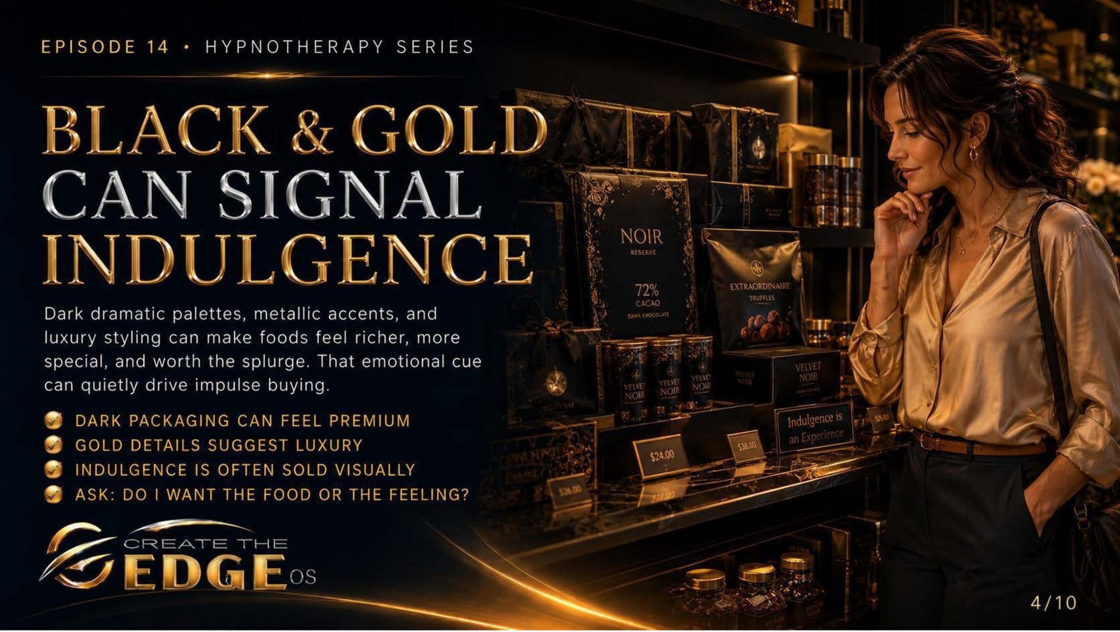
On the slideDark dramatic palettes, metallic accents, and luxury styling can make foods feel richer, more special, and worth the emotional experience. That emotional cue can quietly drive impulse choices: dark packaging can feel premium · gold details suggest luxury · indulgence is often sold visually · ask: do I want the food or the feeling?
Episode 14 · Slide 4
Black and Gold Signal Indulgence
Here is the most emotionally sophisticated category in food marketing, and the one I find most worth examining with real curiosity. Look at these products — all dramatic dark packaging, gold foil, elegant typography, the whole visual vocabulary of luxury and specialness. And notice what it does to you even looking at it. Something in you responds to that aesthetic. Something says that’s special. that’s worth it. I deserve that.
Black and gold in food packaging are doing something specific and worth naming clearly: they’re selling an experience before they’re selling a product. The experience of being someone who chooses luxury. The experience of deserving something elevated. The experience of indulgence as a form of self-care. These are real emotional needs — the desire to feel special, to treat yourself, to experience pleasure and richness. Food marketing in this category has simply learned to activate those needs visually, before the product is even tasted.
And the question the slide asks is probably the most useful one in this entire chapter: do I want the food or the feeling? Because if it’s the feeling you’re after — the sense of luxury, the permission to indulge, the feeling of deserving something beautiful — that’s worth knowing. Not to judge it, but to understand it. Because sometimes the feeling you’re reaching for can be found in ways that actually give it to you, rather than just selling you a version of it in black-and-gold packaging.
I want to say something careful and true here. There is nothing wrong with enjoying beautiful things, with choosing something luxurious because it brings genuine pleasure, with deciding that yes, this particular thing is worth it to you right now. That’s a conscious, present, freely made choice — and it’s entirely different from reaching for something because a visual environment activated a feeling of emotional lack and offered a packaged solution.
The difference between those two things — conscious enjoyment and emotionally reactive reaching — is exactly the gap this chapter is working to create. Not to prevent you from ever choosing the luxurious thing, but to make sure it’s actually your choice, made from a place of awareness rather than automatic response to a carefully designed visual cue.
So next time you feel that pull toward the black-and-gold display, pause for just a breath. Do I want this? Or do I want the feeling it’s promising? And if you want it — really want it — enjoy it fully, without guilt, as the conscious choice it is. That’s the whole invitation.
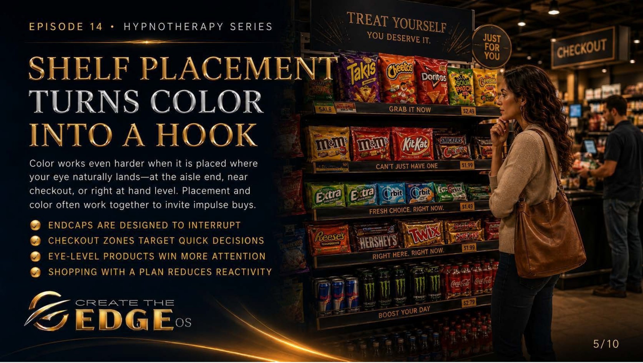
On the slideColor works even harder when it is placed where your eye naturally lands — at the aisle end, near checkout, or right at hand level. Placement and color often work together to invite impulse choices: endcaps are designed to interrupt · checkout zones target quick decisions · eye-level products win more attention · shopping with a plan reduces reactivity.
Episode 14 · Slide 5
Shelf Placement Turns Color Into a Hook
Now look at this display — a checkout endcap stacked floor to ceiling with bright, colorful, emotionally charged products, signs reading “treat yourself, you deserve it” and “can’t just have one.” And notice where this is in the store: right at the checkout, exactly where you’re most likely to be tired, hungry, slightly depleted from making decisions, and waiting with nothing to do but look at these products. The color wasn’t enough on its own. The placement is what turns the color into a hook.
Grocery stores are designed environments — not randomly arranged but carefully, deliberately, scientifically arranged to maximize exposure to high-margin impulse items. Endcaps interrupt your path at the moment you’re transitioning between aisles and most susceptible to new visual input. Eye-level shelving is purchased by brands specifically because your eye naturally lands there, giving those products a built-in advantage before you’ve made any conscious choice. Checkout zones are positioned at the moment of maximum decision fatigue, when your resistance to impulse is lowest.
What the slide is doing is naming all of this without drama — not as a conspiracy but as a design reality. Shopping with a plan reduces reactivity. Not because you’re weak without one, but because a plan anchors your attention to your own intentions rather than leaving it available to be captured by environmental design. When you know what you came for, the endcap display is just something you walk past instead of a decision you have to make.
And there’s something genuinely empowering about understanding the architecture of a space you move through regularly. The store stops being a minefield to navigate with anxiety and willpower and starts being a designed environment that you can move through with awareness. You can notice the endcap and think ah — endcap. interrupt strategy. not on my list. And keep walking. No drama, no self-judgment, no battle. Just awareness.
I want to be honest: this doesn’t mean you’ll never make an unplanned choice again, or that you should. Spontaneous pleasure is real and good. The goal isn’t rigid adherence to a list — it’s the difference between choosing something because you genuinely want it in this moment and reaching for it because a checkout display activated an automatic response while you were tired. One is freedom. The other is the store’s design working as intended.
Take my hand. We’re learning to walk through these spaces as ourselves — with our own intentions intact — rather than as the responsive, susceptible shoppers the layout assumes we are. That’s not rigidity. That’s just coming as who you actually are.
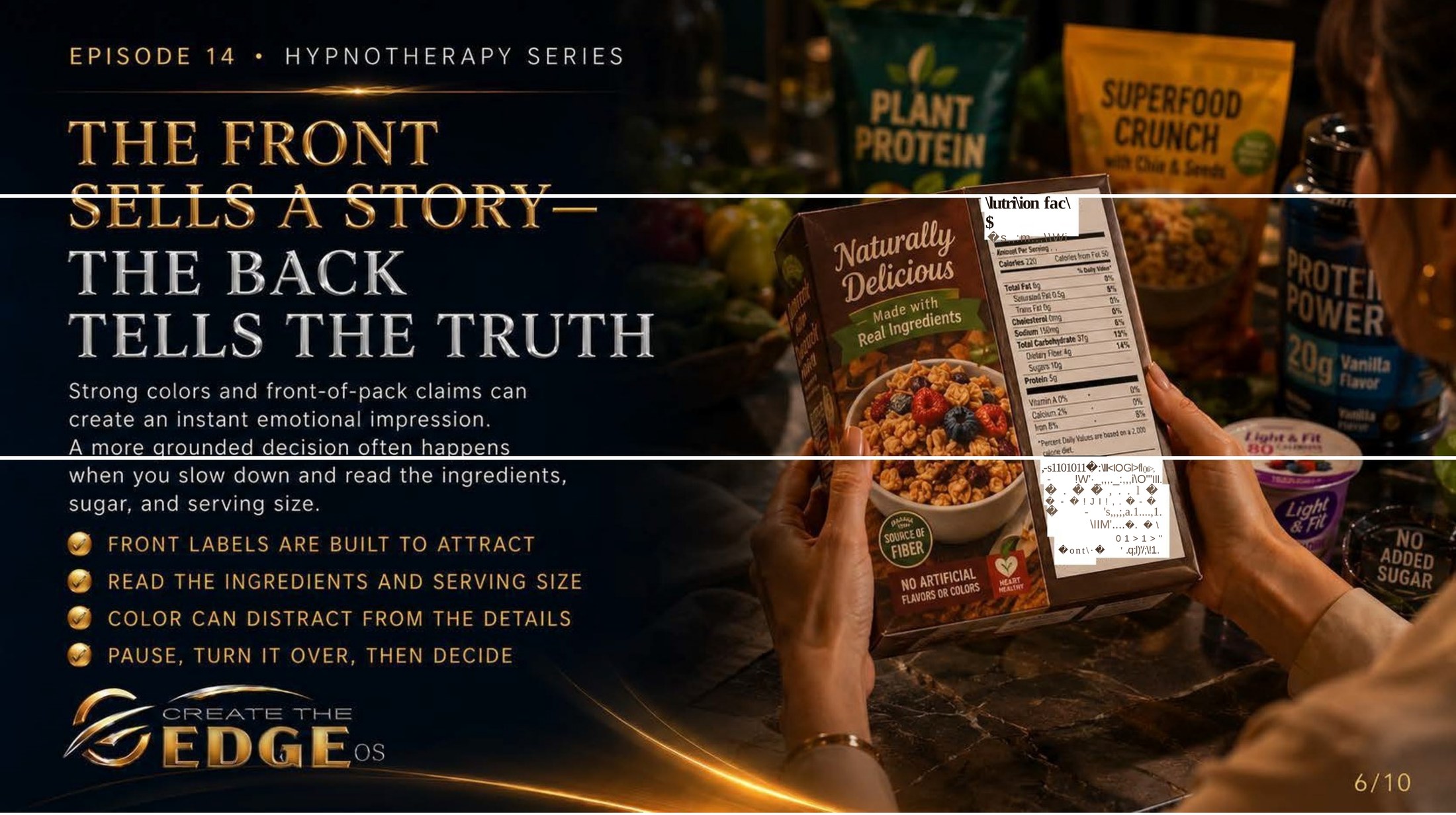
On the slideStrong colors and front-of-pack claims can create an instant emotional impression. A more grounded decision often happens when you slow down and read the actual ingredients: front labels are built to attract · read the ingredients · color can distract from the details · pause, turn it over, then decide.
Episode 14 · Slide 6
The Front Sells a Story — The Back Tells the Truth
Here is the single most practical piece of media literacy this chapter contains, and it’s beautifully simple. Look at her turning the product over to actually read the back. Not the front — not the beautiful illustration, not the warm evocative name, not the “naturally delicious” claim in flowing script — the back. The actual ingredients. That turn of the wrist is an act of self-respect.
The front of a food package is designed by marketing teams. It is optimized to create an emotional response, to communicate a brand story, to make you feel something — naturalness, indulgence, health, comfort, excitement — in the fraction of a second before your conscious mind engages. The colors, the fonts, the images, the claims: all of it is crafted to activate a feeling. And feelings, as we’ve established throughout this whole book, move faster than thought.
The back of the package is regulated information. It tells you what’s actually in the product, in what proportions, in what order. It can’t be designed to activate an emotional response because its format is legally constrained. Which is exactly why the front exists: to create the feeling that makes you reach before you read.
The practice this slide offers is not complicated: pause, turn it over, then decide. Not as a rule you must follow for every product every time — but as a tool available to you whenever you notice that you’re being pulled by a feeling rather than making a choice. The pause creates space. The turn gives information. The decision — whatever it is — now belongs to you rather than to the marketing.
And here’s something I’ve noticed in my own practice of this: sometimes you turn it over and everything aligns, the front story and the back facts agree, and you put it in your basket with full satisfaction. And sometimes you turn it over and the ingredient list tells a different story entirely, and you set it down not with guilt or deprivation but with a simple, clean sense of that’s not what I actually wanted. Both of those outcomes are good. Both of them are you, making an actual choice.
Take my hand. This is one of the smallest, most consistently empowering practices available to you. One breath. One turn. Then decide. That’s the whole thing.
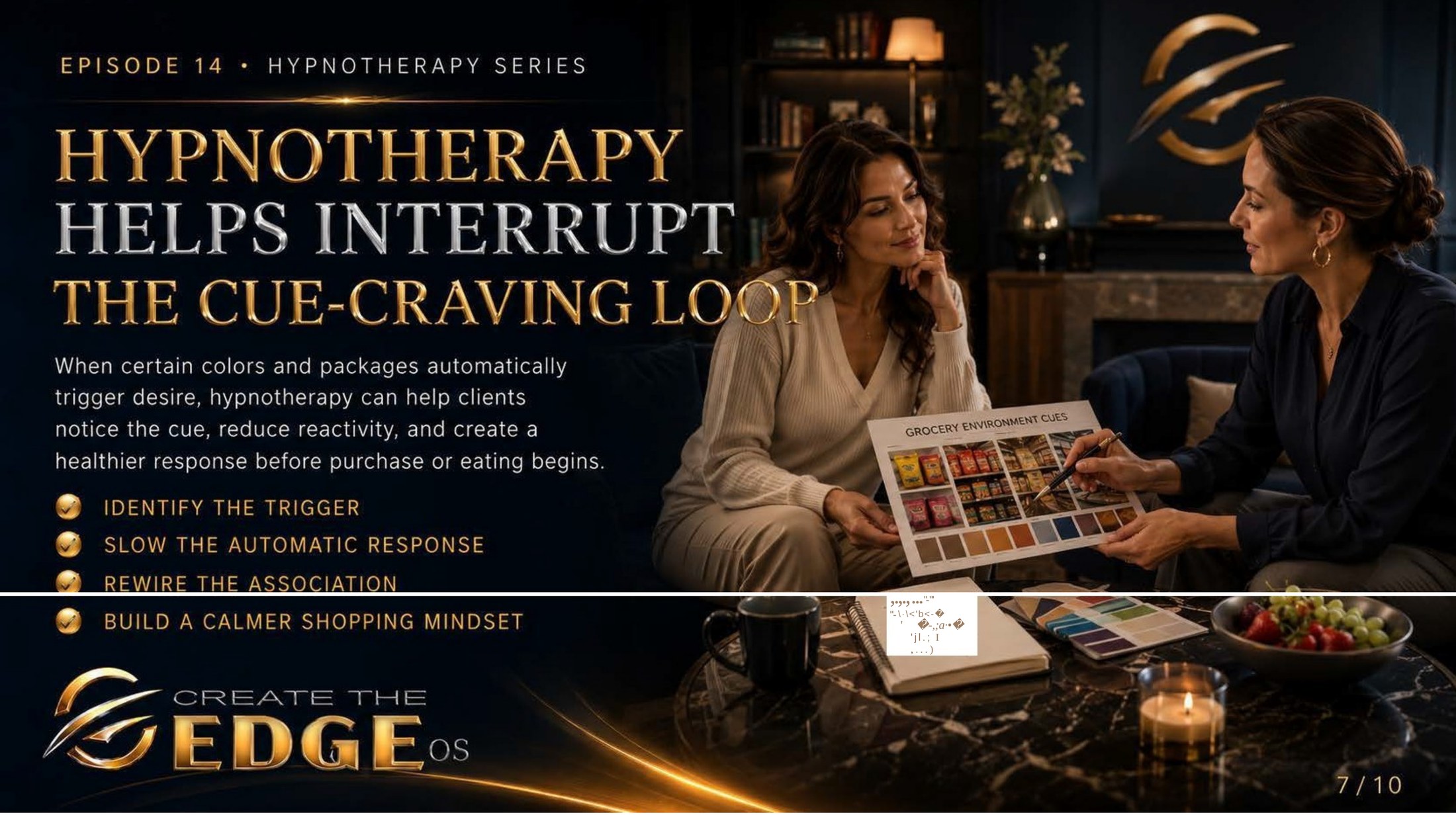
On the slideWhen certain colors and packages automatically trigger desire, hypnotherapy can help notice the cue, reduce reactivity, and create a healthier emotional response before purchase or eating begins: identify the trigger · slow the automatic response · rewire the association · build a calmer emotional baseline.
Episode 14 · Slide 7
Hypnotherapy Helps Interrupt the Cue-Craving Loop
Here is where everything in this chapter comes together in the most important way. Look at this image — a therapist and client working together with color swatches and grocery environment cues, the client in a state of open, relaxed attention. They’re not talking about willpower. They’re not making rules. They’re tracing the emotional architecture of an automatic response — finding the subconscious thread that runs from a particular visual cue to a particular emotional state to a particular behavior — and gently, carefully, updating it.
Because here’s the thing that all the awareness in the world doesn’t fully address: some of our responses to food cues run deeper than information can reach. Some of them were learned in childhood, in emotional contexts that had nothing to do with food but everything to do with comfort, or reward, or the only available form of self-soothing in a moment of distress. Those associations live in the body, not the intellect. You can know, consciously, that the checkout display is designed to target you at a vulnerable moment — and still feel the pull.
That’s not a failure of awareness. That’s the subconscious doing what it learned to do. And the subconscious, as we’ve said throughout this book, doesn’t respond well to lectures. It responds to the kind of gentle, deep, repetitive repatterning that hypnotherapy is specifically designed to offer.
The process the slide names is the same one we’ve explored throughout: identify the trigger — what specific colors, images, environments, or emotional states reliably activate reactive reaching. Slow the automatic response — build in the microsecond of awareness between stimulus and behavior where choice becomes possible. Rewire the association — create new, calmer subconscious responses to those same cues. Build a calmer emotional baseline — so that the urgency and reactivity the marketing counts on has less to grip.
This is not about eliminating desire. Desire is human and beautiful and worth honoring. It’s about the difference between desire that arises naturally from genuine want and desire that is manufactured by a designed visual environment targeting your most automatic responses. One is yours. The other is being done to you. Hypnotherapy helps you find the difference — in your own body, in your own specific history, in the particular places where your nervous system has learned to react.
Take my hand. This is why the work goes deeper than information. This is why understanding the strategy isn’t always enough. And this is why you’re not alone in this — because these patterns were built slowly, by a world that was working on your nervous system long before you knew it, and they’re changed the same way: slowly, with support, and with more compassion than criticism.
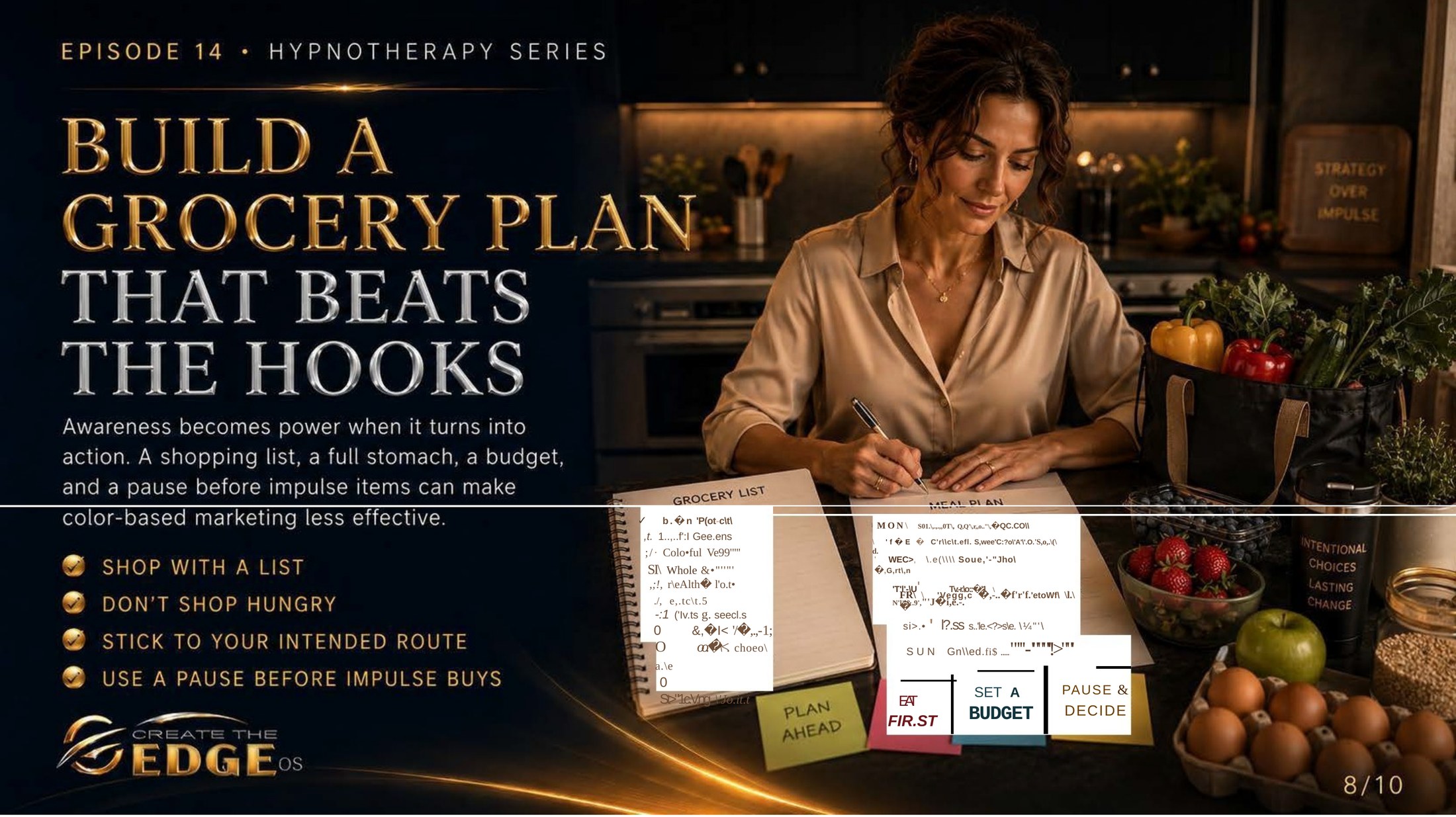
On the slideAwareness becomes power when it turns into simple, repeatable practices. A shopping list, arriving nourished, a budget, and a pause before impulse items can make color-based marketing less effective: shop with a list · don’t shop when depleted · stick to your intended route · use a pause before impulse choices.
Episode 14 · Slide 8
Build a Shopping Approach That Beats the Hooks
Here she is at her kitchen counter before she leaves, deliberately, unhurriedly building her list. And on the wall behind her: strategy over impulse. Not discipline over weakness, not control over desire — strategy over impulse. That framing matters. Strategy is neutral, intelligent, self-respecting. It’s what people who understand the game do before they play it.
The four practices this slide offers are almost embarrassingly simple, and they work. Shopping with a list: not because you can’t be trusted without one, but because a list anchors your attention to your own intentions so the environment’s designs have less purchase on your decision-making. Arriving nourished: not as a moral requirement, but because a depleted, hungry body is neurologically more susceptible to urgency cues and impulse responses. These aren’t personality judgments. They’re biology.
Sticking to your intended route through the store reduces exposure to the interrupt zones — the endcaps, the checkout displays, the promotional islands in the middle of aisles — that are specifically positioned to catch you when you’re transitioning between intentions. And the pause before impulse choices: just a breath, just a moment of stepping back from the automatic response, just enough space to ask do I actually want this, or am I responding to the design?
I want to say something about the energy of these practices, because it matters. None of them should feel like deprivation or struggle or white-knuckling your way through a store. They should feel like going somewhere you know well, with your own plan, your own clarity, and a relaxed confidence in yourself. Not defensive. Not anxious. Just prepared. There’s a real difference in how that feels in your body, and that difference is part of what we’re building.
And here’s what I’ve found: when you move through a store from that prepared, settled place, the impulse displays don’t disappear — but they lose urgency. They become interesting rather than compelling. You can look at the checkout endcap and appreciate the design, notice the strategy, even smile a little at the boldness of it, and keep walking. That’s not suppression. That’s freedom.
We don’t fail, we fall forward. If you’ve ever left a store with a cart full of things that weren’t on your list and felt confused about how it happened, this chapter is for you. Now you know exactly how it happened. And knowing is the beginning of something different.
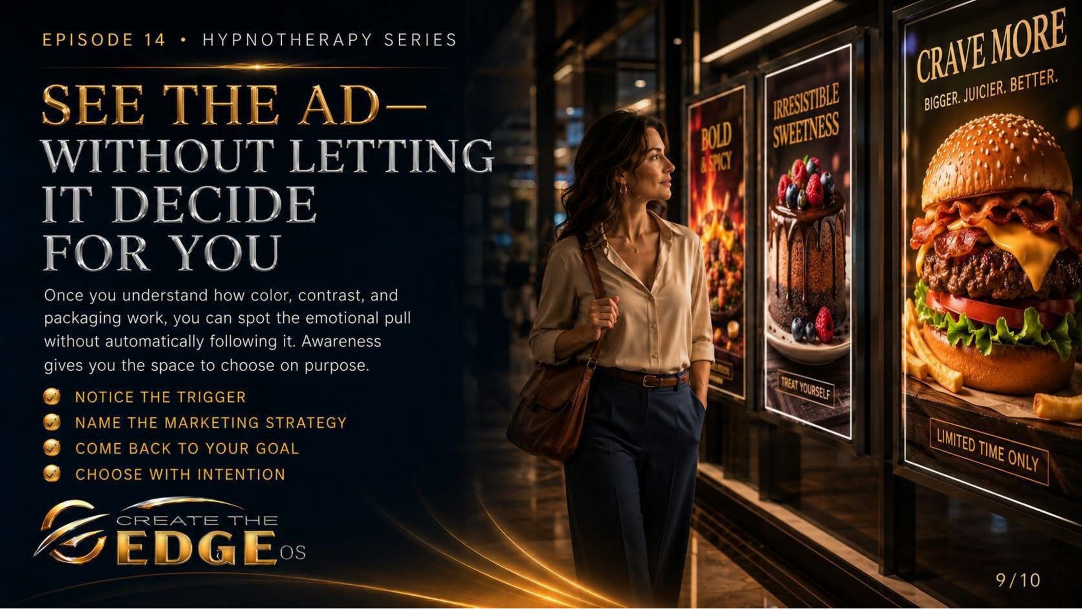
On the slideOnce you understand how color, contrast, and packaging work, you can spot the emotional pull without automatically following it. Awareness gives you the space to choose on purpose: notice the trigger · name the marketing strategy · come back to your own intention · choose with intention.
Episode 14 · Slide 9
See the Ad — Without Letting It Decide for You
Look at her walking past those enormous food advertisements — bold images of burgers and chocolate and bright, stimulating color — and she is simply walking. Not averting her eyes. Not hurrying past in a panic. Not fighting the images or judging herself for noticing them. Just walking, clearly, with herself. The ads are doing what they were designed to do. She is doing what she has learned to do. They are not, in this moment, the same thing.
This is the matured form of everything this chapter has been building toward. Not never feeling the pull — the pull is real and will continue to be real, because you are human and your nervous system will continue to respond to designed visual stimulation. But feeling the pull and automatically following it are two separate things. And the gap between them — the breath, the awareness, the pause — is exactly what this chapter has been cultivating.
The four steps the slide offers are a simple, portable practice for any moment you feel a visual hook: notice the trigger — I can feel the pull of that display. Name the marketing strategy — that’s urgency marketing using warm colors and a limited-time offer. Come back to your own intention — what did I actually come here for? what do I actually want? Choose with intention — whatever that choice is, make it from your own center rather than from the activated, reactive state the marketing was designed to create.
And I want to say something about this practice that I think is important: it gets easier. Not immediately, and not without repetition, but it genuinely builds. The first few times you try to notice and name while standing in a brightly lit store surrounded by designed stimulation, it might feel effortful and a little clumsy. That’s because you’re building a new neural pathway — a new route from stimulus to response that goes through your awareness instead of around it.
Over time, the noticing becomes more automatic than the reaction ever was. You walk past a checkout display and see it without being captured by it. You look at an advertisement and appreciate the craft while remaining anchored in yourself. You stop needing the four-step process because the gap between stimulus and choice has simply become how you move through the world. That’s the destination. And you build it one noticed hook at a time.
Take my hand. We’re building something genuinely valuable here — not the ability to never want things, but the ability to actually choose. To be the author of your choices rather than the subject of someone else’s design. That’s worth the work.
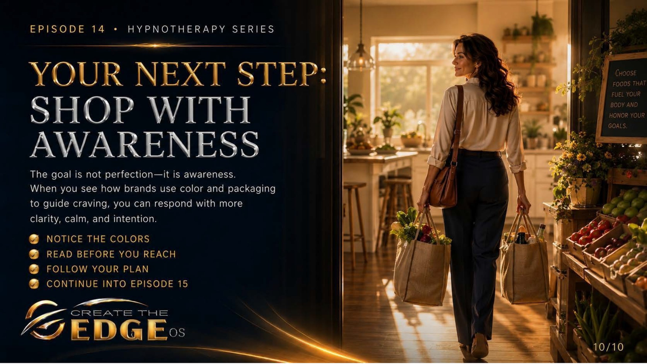
On the slideThe goal is not perfection — it is awareness. When you see how brands use color and packaging to guide emotional responses, you can respond with more clarity, calm, and intention: notice the colors · read before you reach · follow your plan · continue into Episode 15.
Episode 14 · Slide 10
Your Next Step: Shop With Awareness
Look at her walking out of that store — bags in hand, shoulders at ease, the golden light of a warm kitchen waiting behind her and a sign visible on the wall: choose foods that fuel your body and honor your goals. She’s not rigid. She’s not triumphant in the exhausting way of someone who just barely survived something. She’s simply — easy. Like someone who went somewhere she knew well and came back with what she actually went for. That ease is the destination.
The slide says the goal is not perfection — it is awareness. And I want to stay with that for a moment, because it’s a different kind of goal than most of us have been taught to set around food and shopping and eating. Perfection is brittle. One unplanned choice and the whole structure collapses, and then comes the spiral — the shame, the “I’ve already ruined it,” the giving up entirely until some mythical fresh start. We’ve all been there. It doesn’t work.
Awareness is flexible. It doesn’t collapse when you make an unplanned choice — it just notices. I chose that. Here’s why I think I chose it. Here’s what I notice about how I feel now. That’s information. Awareness keeps working even when behavior is imperfect, because awareness isn’t measuring success against an ideal — it’s building understanding, one honest observation at a time.
The three practices this slide sends you home with are beautifully simple: notice the colors — see the visual language being used to create emotional responses around food. Read before you reach — give yourself the information that lives on the back of the package, not just the feeling created by the front. Follow your plan — not as rigid law but as an anchor to your own intentions in an environment designed to redirect them.
And there’s one more thing I want to leave you with as we step out of this chapter and move toward Episode 15. The intelligence and self-awareness you’ve been building throughout this book — about your subconscious patterns, your emotional associations, your relationship with your body and food and self-image — this is exactly the kind of ground from which these practices grow. You’re not trying to white-knuckle through grocery stores with borrowed rules. You’re building a relationship with yourself that makes genuine choice possible.
So take my hand, as always, from right here beside you rather than from some arrived destination. I still notice the endcap displays. I still sometimes feel the pull. And I’ve learned to feel it and choose. We don’t fail, we fall forward, and we go together — into Episode 15 and the next chapter of this unfolding awareness. The path is lit. Let’s keep walking.