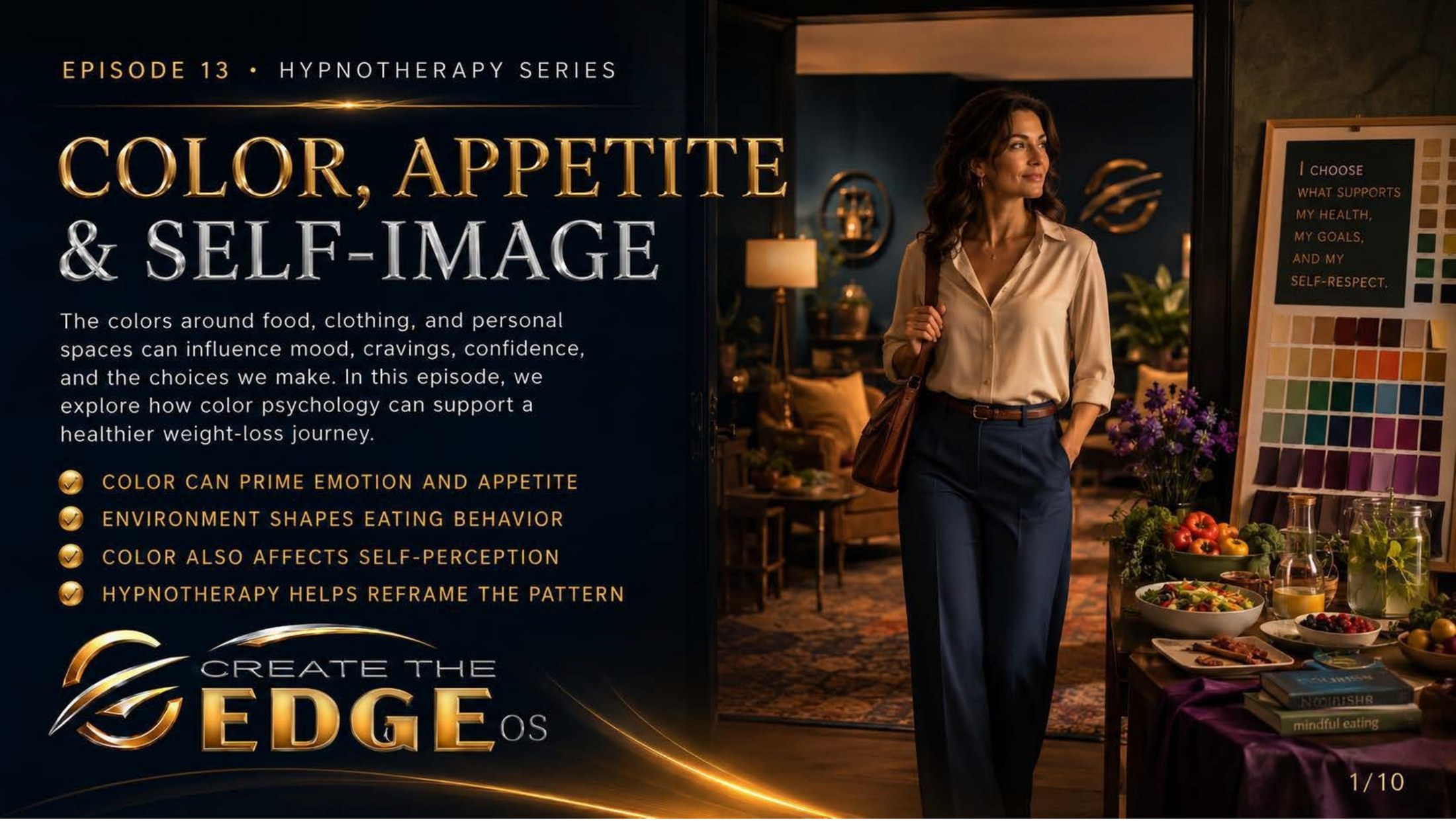
On the slideThe colors around food, clothing, and personal spaces can influence mood, cravings, confidence, and the choices we make. How color psychology can support emotional wellbeing and self-trust: color shapes emotional response · environment shapes behavior · color also affects self-perception · hypnotherapy helps reframe the pattern.
Episode 13 · Slide 1
Color, Appetite & Self-Image
Look at the woman in this image, standing in a golden doorway, a whole room of color and possibility behind her. On one wall, a note: you are color. energy. possibility. choose what empowers you. She isn’t looking at the scale or the menu or the mirror for reassurance. She’s standing in her own light, aware of everything around her and at peace with what she chooses. That’s the invitation this chapter is making: to become conscious of the visual world you move through and how it’s been quietly speaking to the part of you that feels before it thinks.
Because color has been talking to you your whole life. Before you could name a shade, color was shaping your nervous system — calming it, activating it, triggering memories, pulling emotions up from places you’d almost forgotten. The red of your grandmother’s kitchen. The blue of the hospital where something hard happened. The warm gold of the room where you felt most yourself. Color carries your history, and your body responds to it faster than your conscious mind can form an opinion.
This chapter is about making that invisible conversation visible. About noticing what the colors in your eating spaces, your wardrobe, your daily environment have been saying to you — and learning to say something back. Not through force or rules, but through awareness. The kind of gentle, curious awareness that hypnotherapy builds, one layer at a time.
I want to be clear about what this chapter is not. It’s not a list of rules about what to eat or what colors to surround yourself with to make yourself smaller. There are no instructions here, no systems to obey. This chapter is about relationship — the quiet, often unexamined relationship between the visual world around you and the emotional world inside you. Understanding that relationship gives you choice. And choice is the beginning of everything.
The four threads running through this chapter are exactly what the slide names: color shapes emotional response, environment shapes behavior, color affects self-perception, and hypnotherapy helps reframe the subconscious pattern. We’re going to follow each one honestly, without pressure, without performance. Just noticing. Just understanding. And somewhere in that understanding, quietly, something shifts.
So take my hand. We’re not here to overhaul your kitchen or reinvent your wardrobe. We’re here to get curious about the world that’s been shaping you without your permission — and to start shaping it back, on purpose, with kindness. Let’s begin.
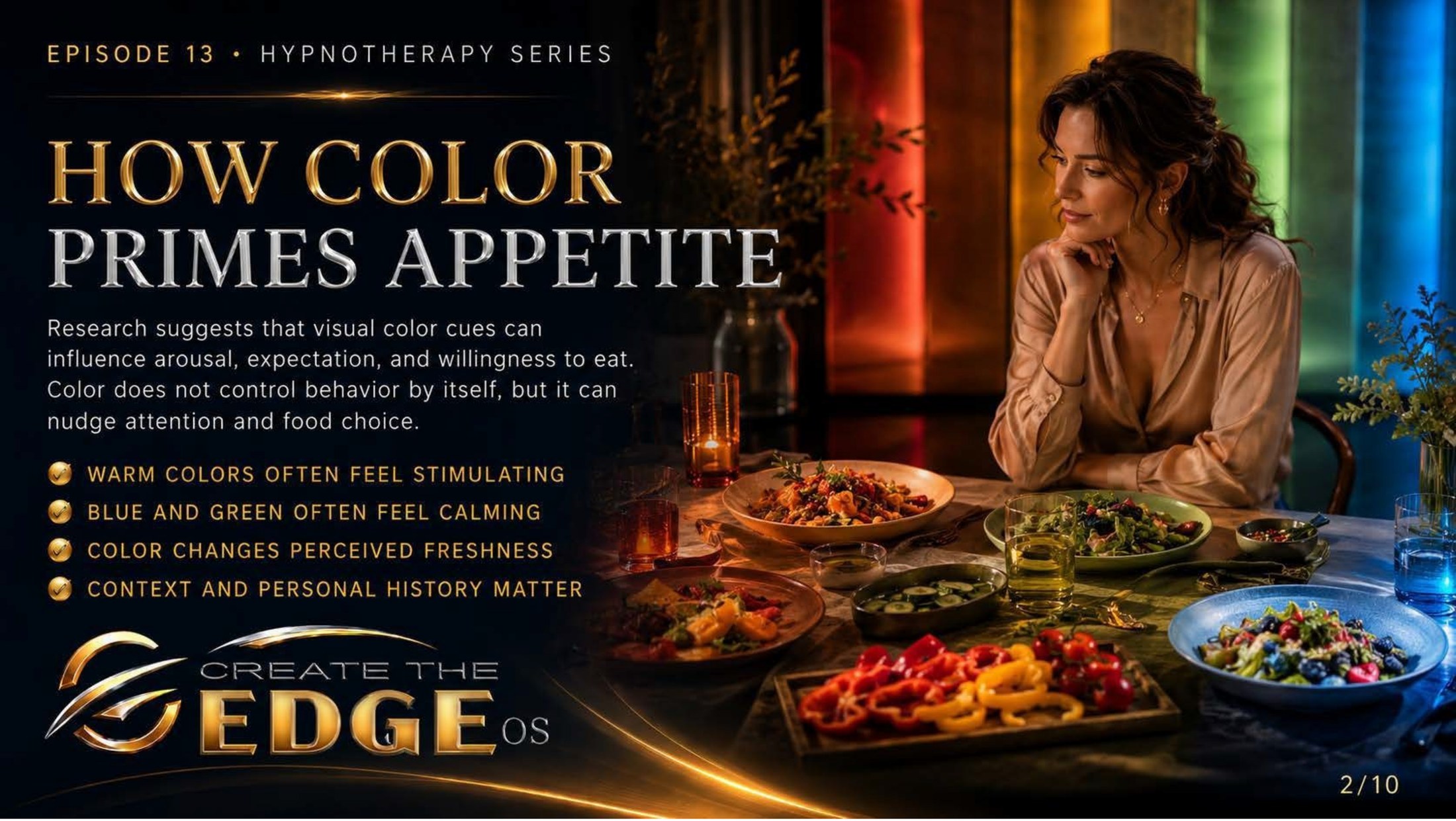
On the slideResearch suggests that visual color cues can influence arousal, expectation, and emotional response around eating. Color does not control behavior by itself, but it can nudge attention and emotional tone: warm colors often feel stimulating · blue and green often feel calming · color changes perceived freshness · context and personal history matter.
Episode 13 · Slide 2
How Color Primes Emotion Around Food
Here she is, sitting at a table laid with color — warm reds and golds on one side, cool blues and greens on the other — her expression thoughtful, almost meditative. She’s not eating urgently. She’s noticing. And that noticing is exactly the skill this slide is building, because what she’s doing is something most of us have never been taught: paying attention to how the visual world around food changes the emotional world inside us.
Research in color psychology tells us that visual cues can influence arousal, expectation, and emotional tone before a single bite is taken. And the slide is careful with its language — can influence, can nudge. Not control, not determine. Color is a conversation partner, not a dictator. It offers a suggestion to your nervous system, and your nervous system responds based on your personal history, your associations, your mood in that moment. The same warm red that feels energizing to one person may feel agitating to another based on what their body learned to connect it with.
Warm colors — reds, oranges, yellows — often carry an activating, stimulating energy. They signal aliveness, warmth, social energy. Cool colors — blues, greens — tend to carry calming, settling qualities. They signal space, ease, slowness. And the context matters enormously: a vivid red in a beloved family kitchen feels entirely different from the same red under fluorescent lights in a place where something hurt.
Here’s what I find genuinely fascinating about this: most of us have been responding to these color signals our entire lives without ever becoming conscious of them. The emotional tone of the environments where we’ve eaten has shaped our relationship with eating in ways we’ve never examined. Anxiety at the dinner table becomes associated with certain colors, certain lights, certain rooms. Peace becomes associated with others. The feeling gets stored in the body without a label.
And here’s the gift in making it conscious: once you know the conversation is happening, you can participate in it. Not by rigidly controlling every visual in your environment, but by simply noticing. What colors make you feel settled and present? What colors seem to activate a kind of urgency or emotional charge? That noticing — gentle, curious, non-judgmental — is the beginning of something real.
We don’t fail, we fall forward. Every time you’ve eaten in a state of emotional overwhelm, in a room that felt harsh or activating, without any awareness of what was happening around you — you weren’t doing it wrong. You just didn’t have this information yet. Now you do. And awareness, as we’ve said throughout this whole journey, is always the first step toward something gentler.
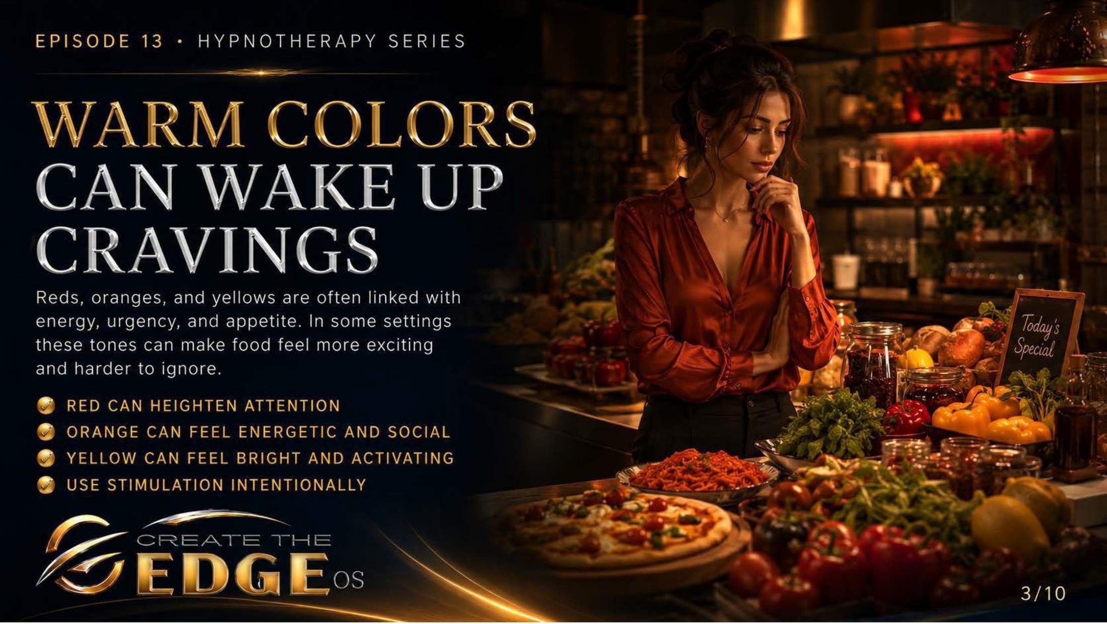
On the slideReds, oranges, and yellows are often linked with energy, urgency, and emotional arousal. In some settings these tones can make emotional responses around food feel more intense and harder to step back from: red can heighten attention · orange can feel energetic and social · yellow can feel bright and activating · use stimulation intentionally.
Episode 13 · Slide 3
Warm Colors and Emotional Activation
Look at the scene behind her — warm amber light, rich reds and golds everywhere, the energy of a busy kitchen humming through the whole image. And notice her expression: she’s not lost in it. She’s present to it. There’s a difference between being swept along by an emotional environment and standing inside it with awareness, and that difference is everything this chapter is teaching.
Warm colors carry activation energy. Red heightens attention — it signals importance, urgency, aliveness. Orange carries social warmth and a kind of stimulating brightness. Yellow activates and uplifts. These are genuine, research-supported tendencies, and they’re also deeply personal — your red is not my red, and both of ours are not the red your mother kept in her kitchen, which lives in your body as something else entirely.
What matters here isn’t the color theory. What matters is what happens in you when you’re in a warm, activating color environment around food. For some people, that energy feels wonderful — alive, social, celebratory. For others, particularly those who carry emotional charge around eating, warm color environments can heighten that charge. The urgency of red can layer onto an already urgent emotional state. The stimulation of orange can push an already stimulated nervous system further from the calm, present place where conscious choice lives.
This isn’t blame. I want to say that clearly. If you’ve spent years eating in highly stimulating environments — brightly lit, warm-toned, visually busy spaces — and you’ve found it hard to feel settled around food, you weren’t doing it wrong. You were responding authentically to an environment that was working on your nervous system without your awareness. That’s not a character flaw. That’s just how human beings work.
The slide ends with four words that are quietly powerful: use stimulation intentionally. Not eliminate it, not fear it — use it intentionally. Maybe the warm, energizing energy of reds and oranges serves you beautifully in some contexts and not in others. Maybe it’s exactly what you want for a joyful, social meal and less helpful when you’re eating alone and trying to come back to yourself. The goal is awareness, not restriction. Knowing how your nervous system responds to color so you can make conscious choices about the environments you create.
Take my hand, and let’s keep moving. We’re building something here — a map of the visual world’s emotional conversation with you. Not to control it, but to understand it. And understanding it, as always, is how we begin to find our way to something gentler.
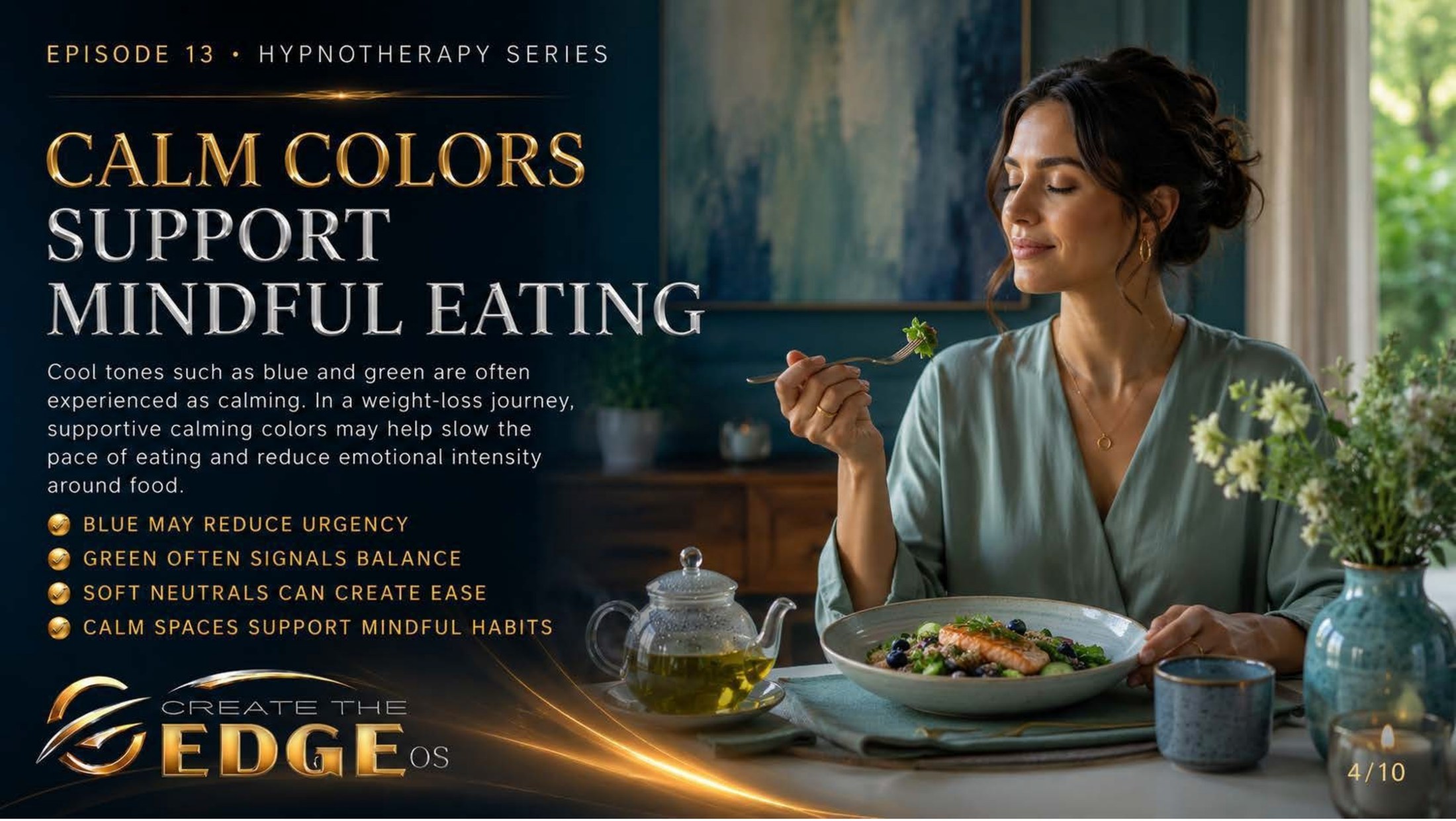
On the slideCool tones such as blue and green are often experienced as calming. Supportive, calming colors may help create a more settled, present emotional state around eating: blue may reduce urgency · green often signals balance · soft neutrals can create ease · calm spaces support mindful presence.
Episode 13 · Slide 4
Calm Colors Support Presence Around Food
Here is the counterpoint, and it’s beautiful. Look at this image: a woman sitting in calm, sage green, eating with what can only be called presence. Soft neutrals around her. Natural light. A cup of something warm, a bowl of something nourishing, the whole scene carrying the energy of ease. She looks like someone who has given herself permission to simply be here, eating this, in this moment, without the noise of judgment or urgency. That’s what this slide is about.
Cool colors — blues, greens, soft neutrals — tend to settle the nervous system rather than activate it. Blue carries qualities of space and calm, a kind of quiet spaciousness. Green signals balance, something close to what we feel in nature when we exhale and let our shoulders drop. Soft neutrals — creams, taupes, grays — create visual ease, a background that doesn’t demand anything from your attention. In these environments, the nervous system has room to slow down.
And when the nervous system slows down around food, something important becomes possible: presence. The ability to actually taste what you’re eating. To notice when you’re satisfied. To eat without the emotional static that so often turns a meal into something more fraught than it needs to be. This isn’t about following rules — it’s about recognizing that your environment is either supporting your capacity to be present or working against it.
I think about all the women I’ve worked with who have eaten quickly, anxiously, in harsh-lit, visually busy spaces, and wondered why they couldn’t seem to find the ease around food that they craved. Sometimes the question isn’t what are you eating but where, and in what emotional state, and what is the visual world around you telling your nervous system while you eat. These aren’t small questions.
The slide offers something quietly radical: calm spaces support mindful presence. Not a diet. Not a plan. A quality of environment that supports a quality of being. And you can build that in small ways. A candle on the table. A few minutes of quiet before you sit down. Turning off the loud television. Eating near a window with natural light. These aren’t lifestyle rules — they’re tiny acts of self-support that say to your nervous system: you are safe here. slow down. this is nourishment, not emergency.
That message — you are safe here, slow down — is one that many of us never got to hear around food. So we’re learning to say it to ourselves now, through the spaces we create, the colors we choose, the quality of attention we bring to the simple act of eating. Take my hand, and let’s keep building that.
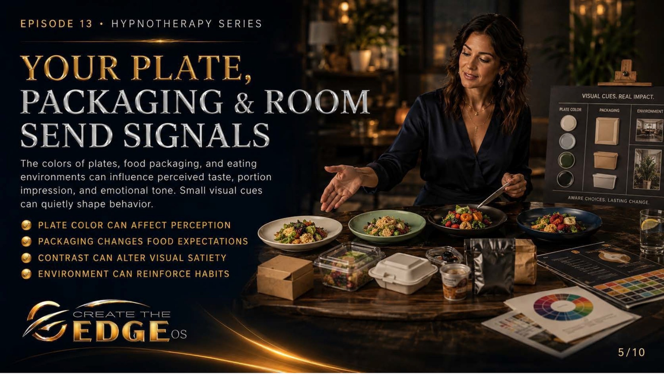
On the slideThe colors of plates, food environments, and eating spaces can influence perceived experience and emotional tone. Small visual cues can quietly shape how we feel during and after eating: plate color can affect perception · packaging changes food expectations · contrast can alter visual experience · environment can reinforce habits.
Episode 13 · Slide 5
Your Plate, Your Space, Your Signals
Look at the table in this image — a spread of beautiful ceramics in different tones, the food itself arranged with care, a color wheel and swatches beside them like tools of intentional design. She isn’t just eating. She’s thinking about how the visual context of eating shapes the emotional experience of it. And what strikes me most is how deeply sane that is — how obvious it becomes, once you see it, that the visual container of a meal is part of the meal.
The color of your plate matters. This isn’t fanciful — there’s real research suggesting that the contrast between plate and food, the color of the plate itself, can subtly shift how we perceive and experience what we’re eating. A white plate can make colors pop and feel vivid. A dark plate changes the visual weight of a meal. A plate in a color you associate with care and beauty might make eating feel like an act of self-regard rather than just fuel intake.
The environment where you eat tells a story to your nervous system before the first bite. A cluttered counter, a glaring overhead light, a screen full of conflict — these aren’t neutral. They’re signals. And your body, trained by years of experience to read signals, responds. Eating in a visually chaotic environment while emotionally dysregulated reinforces a certain relationship with food — one where eating is something you do at yourself, urgently, without presence.
And here’s the quiet revolution in what this slide is offering: you can change the signals. Not through a dramatic overhaul, not by buying things you can’t afford, not by following someone else’s aesthetic. By simply noticing what your current environment is saying — and making one small shift toward something that says something kinder. A favorite mug. A cloth napkin instead of paper. Eating at the table instead of standing over the counter. One candle. A plant on the windowsill.
These small things are not trivial. They are the architecture of how you relate to yourself around food. Every tiny act of care you build into the physical environment of eating is a message to your subconscious: this matters. you matter. this moment deserves to be held with some intention. That message, delivered consistently, starts to shift the emotional pattern at the root of how you experience eating.
We don’t fail, we fall forward. If your eating environment has been harsh or chaotic or utterly unconsidered until now, that’s not failure — that’s the starting point. And starting points, as this whole book has insisted, are just the beginning of a gentler story. Take my hand. One small, intentional thing. That’s all we need to start.
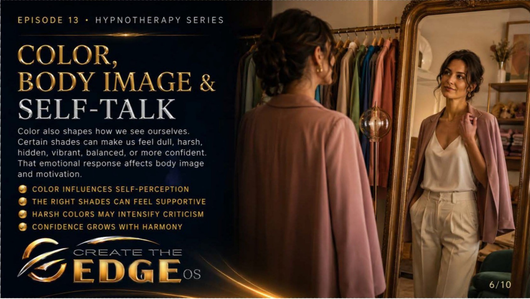
On the slideColor also shapes how we see ourselves. Certain shades can make us feel dull, harsh, hidden, vibrant, balanced, or more confident. That emotional response affects body image and self-perception: color influences self-perception · the right shades can feel supportive · harsh colors may intensify self-criticism · confidence grows with harmony.
Episode 13 · Slide 6
Color, Body Image & Self-Talk
And here we come to the part of this chapter I find most personally true. Look at her — standing before a mirror in a blush-toned coat, the whole image warm and soft and somehow deeply kind. She isn’t inspecting herself for flaws. She’s looking at herself in a color that seems to be on her side, and you can feel the difference in her posture. This is what we explored in the last chapter — the way color and self-perception are woven together — and now we see how it connects to the emotional relationship with food and the body.
Because the clothes you wear while you eat, the colors you put on your body on a difficult day, the mirror you catch yourself in on a hard morning — these things affect your emotional state, and your emotional state affects everything. The more emotionally activated and self-critical you feel, the harder it is to be present and kind with yourself around food. It’s all connected. Body image and self-talk and the visual world aren’t separate rooms. They’re the same room.
The slide makes a beautiful and honest observation: harsh colors may intensify self-criticism. I want to sit with that for a moment. If you’ve ever caught yourself in a harsh, unflattering light or a color that seemed to amplify every perceived flaw, you know this in your body. The inner critic gets louder. The body feels more like a problem than a home. And from that emotionally contracted, self-critical place, kindness toward yourself — in any form, including how you nourish yourself — becomes much harder to access.
The inverse is equally true: the right color, the right light, a shade that makes you feel somehow more you — can quiet the inner critic, even slightly. Can create a moment of oh, there I am. Confidence grows with harmony, the slide says. And while clothing color alone isn’t the whole story of self-image, it is a real and underappreciated thread in it. The visual cues you surround yourself with, including the ones on your own body, are part of the emotional environment you live in.
So the question this slide invites is a gentle one: what colors make you feel more like yourself? Not smaller, not corrected, not closer to some imaginary standard — but genuinely more you. More present, more grounded, more settled in your own skin. Those colors are worth knowing. Not as rules, but as resources. As a small, everyday act of choosing an environment that’s on your side rather than working against you.
Take my hand. We’re building an inner landscape here that is gradually, quietly, becoming kinder — in the spaces around you and in the story you carry about the body you live in. We go together.
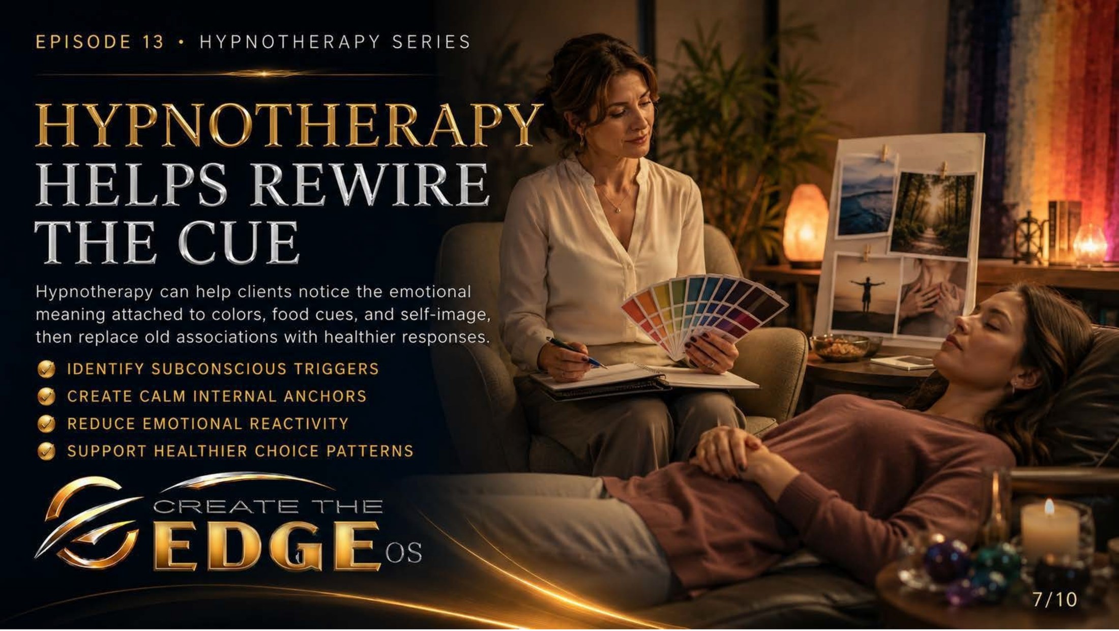
On the slideHypnotherapy can help identify the emotional meaning attached to colors, food cues, and self-image, then replace old associations with more supportive responses: identify subconscious triggers · create calm internal anchors · reduce emotional reactivity · support healthier emotional patterns.
Episode 13 · Slide 7
Hypnotherapy Helps Rewire the Emotional Cue
Here is the image that brings everything together: a therapist sitting with a client in a warm, candlelit room, color swatches in hand, the client deeply relaxed. This is the work. Not the analyzing of color theory, not the intellectualizing of environmental psychology — but the quiet, deep work of reaching into the subconscious and finding what the colors actually mean to this particular person. Because that’s where the real story lives.
You have associations with colors, with food environments, with the sensory cues around eating that were formed long before you had language for them. The smell of something cooking in a certain kitchen. The color of the plates at a table where things were tense. The harsh light of a room where someone made a cruel comment about your body. The warm gold of a place where you felt safe and loved and fed without complication. These associations are stored in the body as emotional truths, and they shape your responses to the present moment without your awareness.
This is exactly what hypnotherapy is built to reach. The slide names the process clearly: identify subconscious triggers — discover what colors, environments, and sensory cues carry emotional charge for you and why. Create calm internal anchors — build new associations that bring the nervous system toward steadiness rather than reactivity. Reduce emotional reactivity — loosen the automatic, lightning-fast response that fires before your conscious mind can intervene. Support healthier emotional patterns — install new responses that align with who you are now, not who you were when the old patterns formed.
This is not about erasing your history. It’s about updating it. The red that carried urgency because you learned urgency at tables where urgency lived can be gently, compassionately revised. Not to make you forget — but to free you from a response that no longer serves the person you’ve become. The body is not a fixed machine. It’s a living, learning system, and it learns as long as you’re alive.
I want to tell you something I’ve witnessed again and again in this work: the moment a person recognizes the connection between an old emotional environment and a current response — the moment they see oh, that’s why that happens — something relaxes. The shame lifts a little. The self-blame softens. Because it was never about willpower or weakness. It was about a pattern, learned in a specific context, doing exactly what learned patterns do: repeating.
And patterns, once seen, can be changed. That’s the whole promise of hypnotherapy, and the whole promise of this chapter. We see the pattern. We reach the place where it lives. And together, slowly, with kindness, we teach the nervous system something new. Take my hand. That’s what we’re doing here.
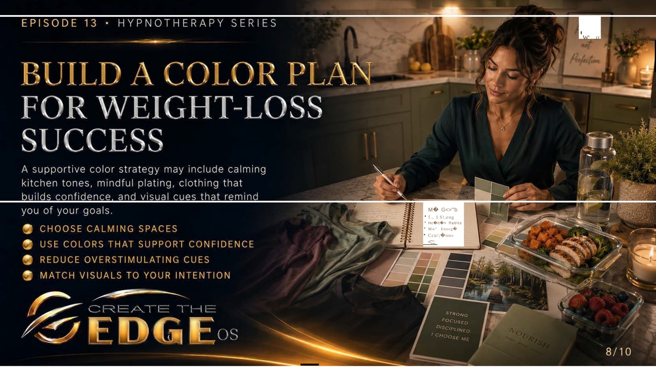
On the slideA supportive color awareness may include calming spaces, clothing that builds confidence, and visual cues that reinforce self-compassion and intention: choose calming spaces · use colors that support confidence · reduce overstimulating cues · match visuals to your intention.
Episode 13 · Slide 8
Building a Supportive Color Environment
Look at this image and notice how intentional it feels. A woman at a green kitchen counter, surrounded by color swatches, a vision board, nourishing food arranged with care — and on a notepad nearby, words like I choose what supports my health, my goals, and my self-respect. This isn’t a diet plan. It’s an intention. An environment built to hold a particular quality of relationship with herself — one of awareness, self-compassion, and conscious choice.
Building a supportive color environment doesn’t mean redecorating your home or buying a new wardrobe. It means starting to make small, intentional choices about the visual space you inhabit — and asking, for each choice: does this serve me? does this support the version of me I’m becoming? It’s a practice of self-regard expressed through the simplest, most everyday decisions.
Calming spaces: what one change could make the space where you eat feel five percent quieter? A different light. A plant. Moving the clutter off the table. Eating away from the screen for one meal. These are not rules — they are invitations. If even one of them calls to you, that’s your body telling you something about what it needs.
Colors that support confidence: we’ve talked about this in the last two chapters, and it bears repeating here because it matters. The color on your body affects how you feel in your body, and how you feel in your body affects your relationship with it. Wearing something that makes you feel even slightly more settled, more present, more like yourself isn’t vanity. It’s self-support. It’s building the emotional environment from the inside out.
Reducing overstimulating cues: this is perhaps the most honest one. We live in extraordinarily visually stimulating environments — screens, advertisements, packaging designed by experts to activate exactly the emotional responses that make our choices harder. You cannot remove all of this from your world. But you can create pockets of visual calm within it. Moments of intentional quiet. Spaces that don’t demand anything from your nervous system.
The slide’s last point — match visuals to your intention — is the thread that runs through all of it. What is your intention? Not a goal measured by external standards, but a quality of relationship with yourself. Peace. Presence. Self-compassion. Trust. What visual choices support that quality? Those are the choices worth making. Everything else is just noise.
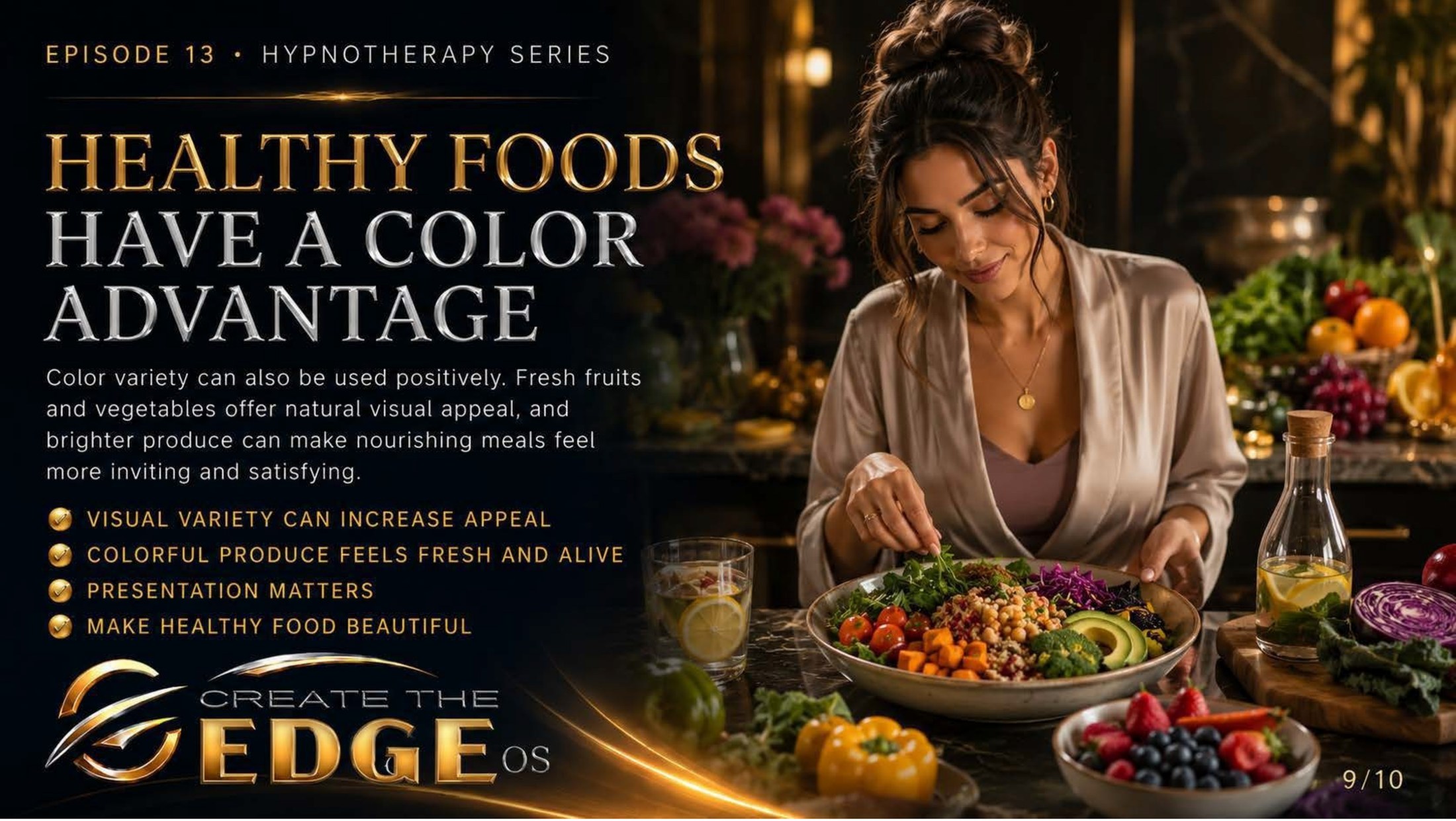
On the slideColor variety can be used with intention. Fresh produce and colorful nourishing foods offer natural visual appeal that can make eating feel like an act of care: visual variety can increase appeal · colorful produce feels fresh and alive · presentation matters · make nourishing food beautiful.
Episode 13 · Slide 9
Color and the Joy of Nourishment
Here is a gift hidden in this chapter, and I saved it for near the end because it deserves to land without the weight of everything else pressing on it. Look at this image — a table so abundantly colorful it almost vibrates, oranges and purples and greens and reds, the sheer aliveness of it almost startling. She’s not eating from obligation or duty or some external standard. She’s eating from a place that looks a lot like delight.
Color, it turns out, is one of the great gifts that nourishing food already comes with. Before any cooking, before any arrangement, before any intention — fresh produce is already doing what this whole chapter is about. It’s speaking to the part of you that responds to color before your conscious mind forms an opinion. And what it says, in the language of reds and oranges and deep greens and bright yellows, is: alive. fresh. abundant. good.
I want to offer this not as a rule but as an invitation to play. What if nourishing yourself could feel, at least sometimes, like something beautiful? What if the act of preparing food that’s colorful and alive were an act of self-regard rather than self-discipline? What if making your plate visually appealing were less about appearance and more about sending yourself a message: you deserve something beautiful today.
Presentation matters — not because you need to perform for anyone, but because the visual cues you give yourself before eating shape the emotional tone of the experience. A meal arranged with even a little care looks like an act of love. And eating something that looks like an act of love tends to feel different from eating something grabbed hurriedly from a container without a second thought.
This is especially tender for those of us who have had complicated relationships with food — where eating has felt like a battlefield rather than a pleasure, where the act of nourishing the body has carried so much weight that the simple joy of color and taste and abundance got lost entirely. I don’t want to rush you toward anything. But I do want to say: that joy is still there, waiting. Underneath all the rules and the shame and the history, the simple human capacity to be delighted by color and taste is still alive in you. We’re going to let it come back slowly, on its own terms.
So take my hand and just look at this image for a moment longer. Let something in you simply enjoy the colors. Not for any reason. Not toward any goal. Just because color is alive and you are alive and aliveness, right now, is enough.
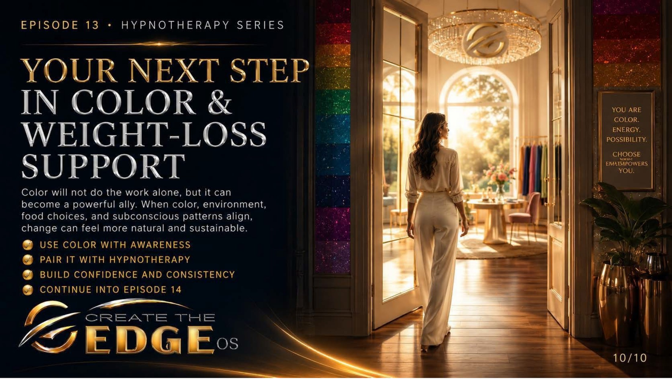
On the slideColor will not do the work alone, but it can become a powerful ally. When color, environment, emotional patterns, and subconscious beliefs align, change can feel more natural and sustainable: use color with awareness · pair it with hypnotherapy · build confidence and consistency · continue into Episode 14.
Episode 13 · Slide 10
Your Next Step in Color Awareness
Look at this doorway. Golden light streaming through, a path opening, the whole image carrying the feeling of something beginning rather than ending. And on the wall beside her: you are color. energy. possibility. choose what empowers you. That’s the chapter in a single sentence — not a prescription, not a system, but an invitation to see yourself as someone with agency over the visual world you inhabit, and to use that agency in service of your own wellbeing.
The slide makes a point worth holding: color will not do the work alone. And that’s important to say clearly, because nothing we’ve discussed in this chapter is a shortcut or a substitute for the deeper work of changing the subconscious patterns around food, body, and self. Color is an ally — a real, meaningful, often underestimated one — but it’s an ally in service of the inner work, not a replacement for it.
What makes color powerful in this context is exactly what the slide names: alignment. When the visual environment around you is calmer, when your clothing supports rather than undermines how you feel in your body, when the emotional associations you carry with food and eating are being consciously and compassionately addressed — all of these working together create a kind of coherence. And coherence feels like ease. Ease is what sustainable change is made of.
Look at the four steps on the slide: use color with awareness, pair it with hypnotherapy, build confidence and consistency, continue the discovery. Notice what they have in common. They’re all ongoing. None of them is a single moment of arrival. This is a practice — a lifelong, evolving, gradually deepening practice of paying attention to the visual world and your emotional response to it, of making small intentional choices that align with the person you’re becoming.
And the very last step — continue the discovery. Because you will keep discovering things about yourself and color and environment that you couldn’t have known at the beginning of this chapter. The map keeps expanding as you walk further into it. Every room you notice differently, every meal you approach with a little more awareness, every morning you choose a color because it makes you feel like yourself — these are all steps on the path.
So here is my hand, as always, reaching out not from the far end of some finished journey but from right here beside you on the road. I haven’t arrived. I’m still learning which colors settle me and which ones stir up old noise. We don’t fail, we fall forward, and we go together — into Chapter 14 and beyond, into the full, rich, ongoing discovery of who you are and what supports you. The path is lit. Let’s keep walking.